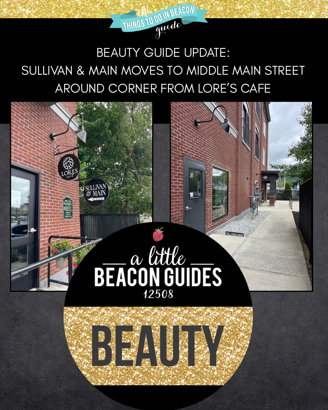
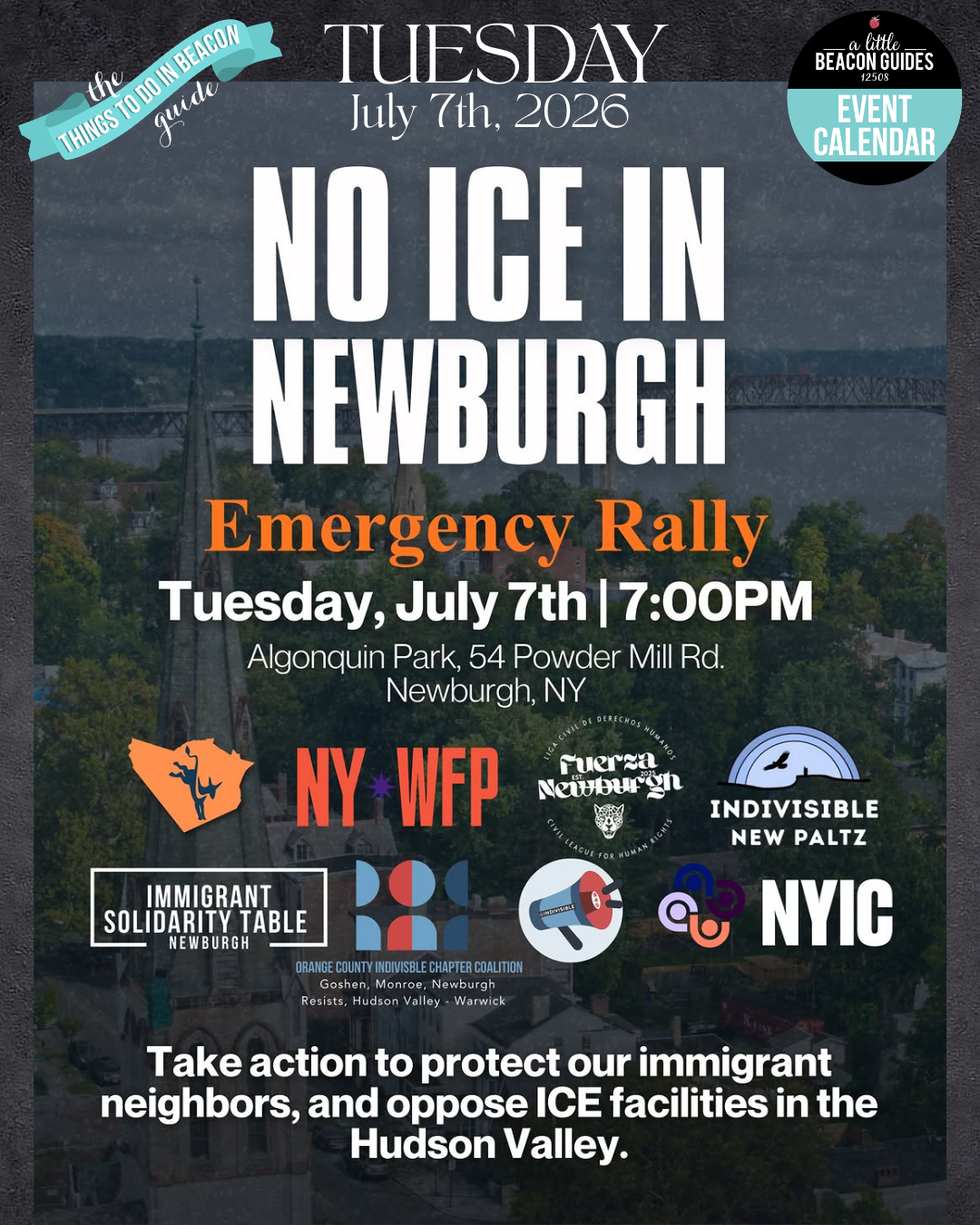
The Luminous Bride Has Moved! Around Corner From Lores Cafe, Inside Of Sullivan & Main
/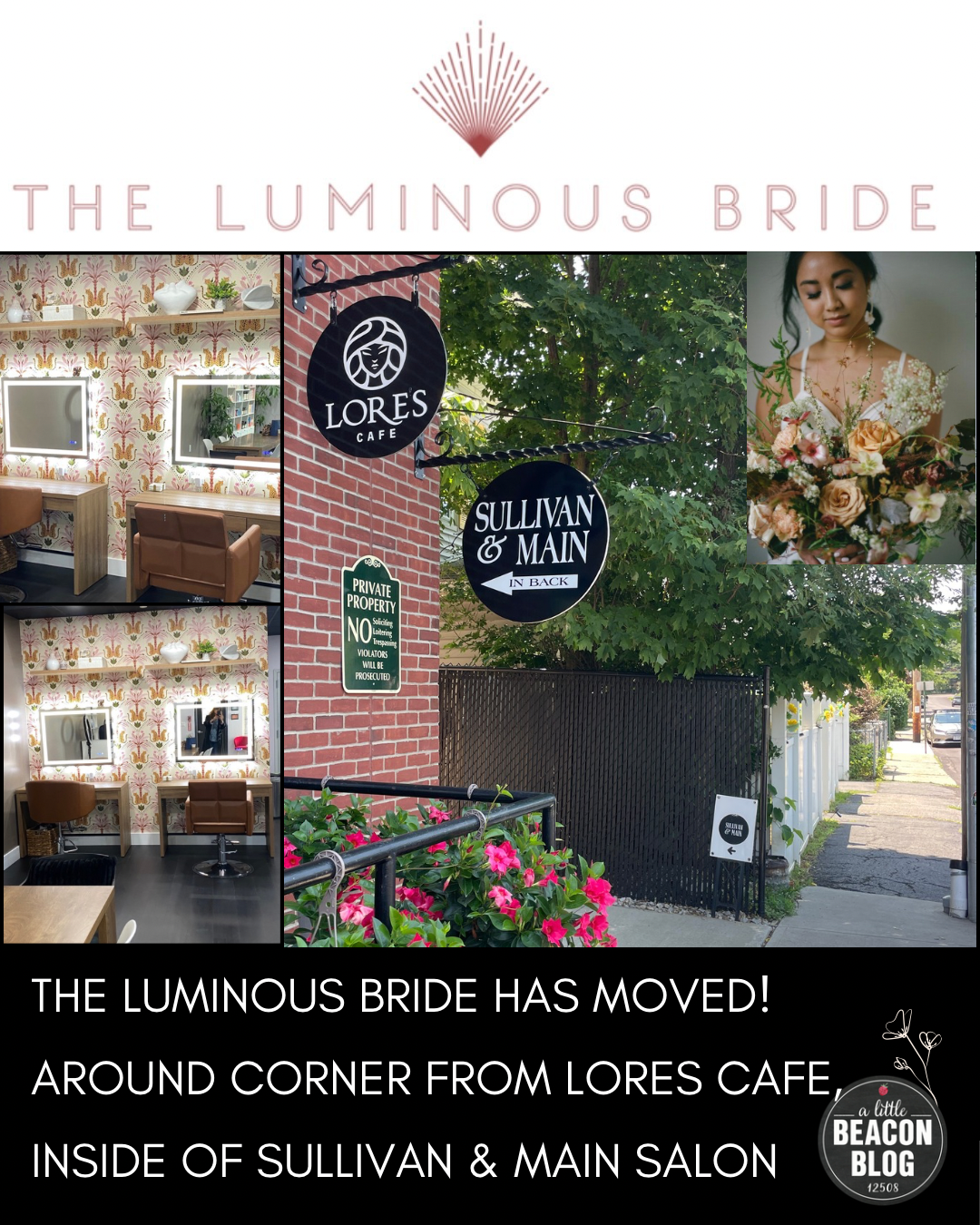
The Luminous Bride has moved! Once located down near the mountain and the old train tracks, this makeup studio has relocated to 249 Main Street Unit 105, sharing the space with Sullivan & Main Salon next to Lores Cafe in what is becoming a beauty enclave, with Vivash Aesthetics around the corner. This spot is opposite the Dutchess County DMV Parking Lot, so plenty of free municipal parking is available.
The Luminous Bride honors the uniqueness and individuality of all of their clients. Offering makeup for Weddings, Special Occasions and Beauty Pop Ups. Owner and Luxury Editorial Bridal Beauty Artist Jules Waldkoetter knows her clientele so well, she also offers Trials for makeup visions to see how the blended colors and lines fit.
With over a decade of experience and a reputation for elevated, on-location bridal beauty, Jules has built a trusted brand known for refined artistry, a calming client experience, and a highly curated team of professionals. The new studio marks an exciting evolution for the business—offering clients a dedicated, thoughtfully designed space for bridal trials, beauty services, and creative collaboration.
“This new studio is a meaningful next step for me,” says Jules. “It allows me to bring my clients into a space that reflects the experience I aim to create — one that feels elevated, welcoming, and personal.”
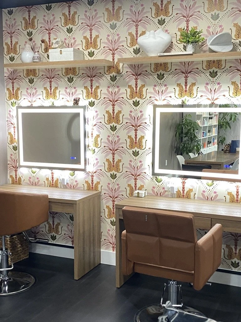
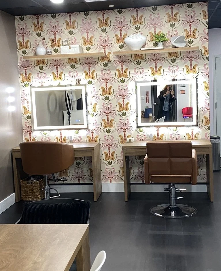
Located inside Sullivan and Main Salon, a growing hub for modern beauty in Beacon, the studio reflects Jules’ signature aesthetic: a balance of soft luxury, warmth, and editorial-inspired design. The space has been intentionally created to provide a serene, elevated environment where clients can feel both relaxed and confident during their beauty experience.
While continuing to serve a high volume of weddings throughout the Hudson Valley and beyond, the studio will function as a home base for trials, team education, and brand growth.
Jules and her team specialize in editorial-leaning luxury bridal beauty services, offering both in-studio and on-location experiences for weddings and events.
For more information, inquiries, or bookings, please visit www.theluminousbride.com or follow along on Instagram at @theluminousbride. The Luminous Bride can be found in ALBB’s Beauty Guide and is a member of the Business Directory.