ALBB Goes Into Hyper Focus Mode To Fine-Tune Branding; From Baby Blocks to Chickens to Fonts
/
The time has come to tweak the logo again at A Little Beacon Blog. As ALBB publishes harder news stories and communicates with Communication Directors and Crisis Manager PR firms hired by companies we may write articles about, ALBB needed to make sure the logo is locked in to handle the responses from readers, companies and municipalities.
While maintaining the friendly, fresh air feel ALBB is known for. Might debate the word “friendly,” since people who don’t like certain articles will turn around that word to demand ALBB be more “nice.” Since ALBB has picked up the nickname La Diabla Blanca after this article, we’ll stick with “breath of fresh air.”
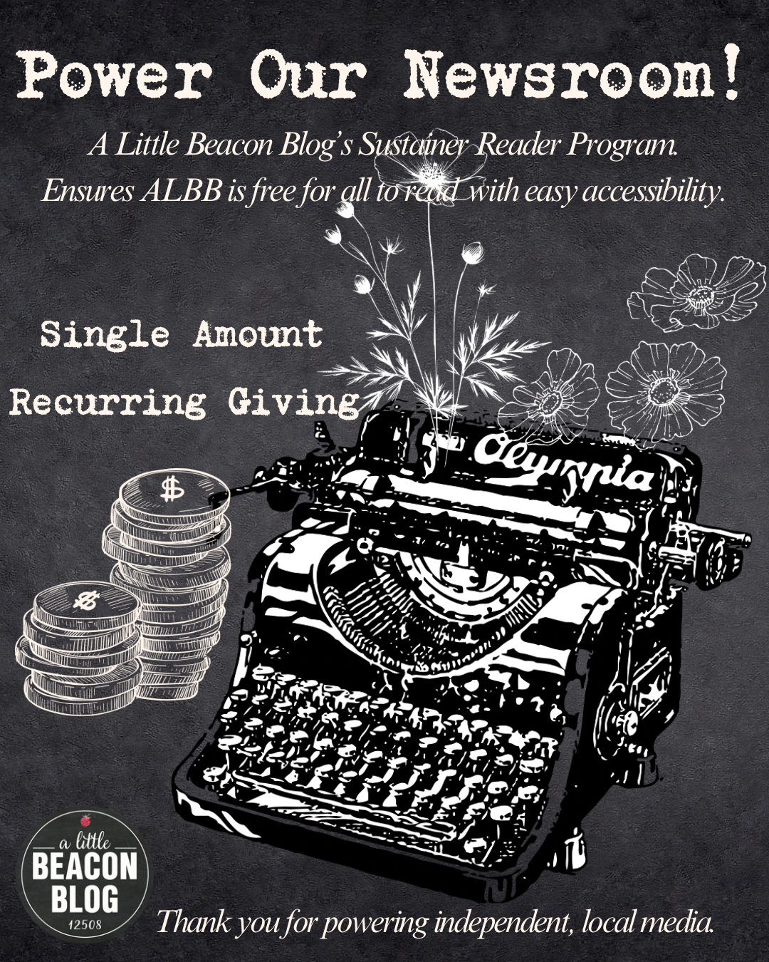
Plus, people request ALBB’s Media Kit. Which is a respectable and professional thing to do. We’ve just always had advertising pricing on the Media Kit web page. But people want it in a PDF. Like a book. Therefore. This has resulted in a pause in writing in order for visual thinking to take over and get this done.
Hyper Focus Mode Activated
Some who know me (Katie) behind the scenes know that I have been working on this Media Kit for years and years. There is a weird mental block to finishing it. “Hyper Focus Mode” means that everything else pauses. All article writing stops (except for emergencies, like snow plowing or water main breaks). Blaze Gomez over at News 12 has it covered in the ICE facility in Chester, NY, so we will run a catch-up article on the nonsense in Chester, NY (Orange County) that has been transpiring there.
It is very frustrating to not write the articles, because you want The Beacon News. And so do we. Additionally, ALBB clients want their ideas for advertising messages delivered to you in a way that you love and value. Bouncing around creative corners of my mind is my specialty. It is a trait I have embraced as a gift. To pour into everyone. Other people’s success does bring me such joy.
But the time has come to fill my own cup. To secure my own self financially. And that begins in branding.
Therefore…To Instagram! “Readers: What Do You Think!?”
I took it to Instagram. Uploading a video of WIP (Work In Progress) is instantaneous at Instagram. First thoughts go there sometimes.
First step was to address the cursive in the logo. I love cursive. I write in cursive. Cursive is a dying script in this country, leaving it unreadable to many. I find this a benefit. If I write in cursive, it can be my secret language.
The logo currently uses the font called Very Berry. Which is very “cutesy". While A Little Beacon Blog’s logo originated in extreme cutesy, it graduated to be primarily black, via use of a chalkboard black, to sync with chalkboard signs out on the sidewalks that businesses use. More of a sophisticated look.
In the present time, I am keeping this base of black. And the name. But I took to change the font. Which generated some reader response (scroll down):
One longtime reader, after seeing the above video at Instagram, wrote in moments later to cling to the original font. “There will be chaos!!” they said. “Why fix what ain’t broke?”
Point taken. But is it working? Are the logo and fonts working? Now that we are swimming with more sharks? Now that a newspaper (Times Union) actually refused to publish (and deleted!) the article about how some anonymous letter writer targeted 20+ businesses in Beacon, demanding they protest A Little Beacon Blog after we started covering Palestine?
(If you didn’t know about this, no worries…I didn’t publish it…I was too afraid of too many things to publish it…but this article will be published soon…)
The main takeaway from the reader’s warning of the font change was…Wow. The readers do care, and do feel that A Little Beacon Blog’s brand identity is part of their own. This is a heart-moving moment.
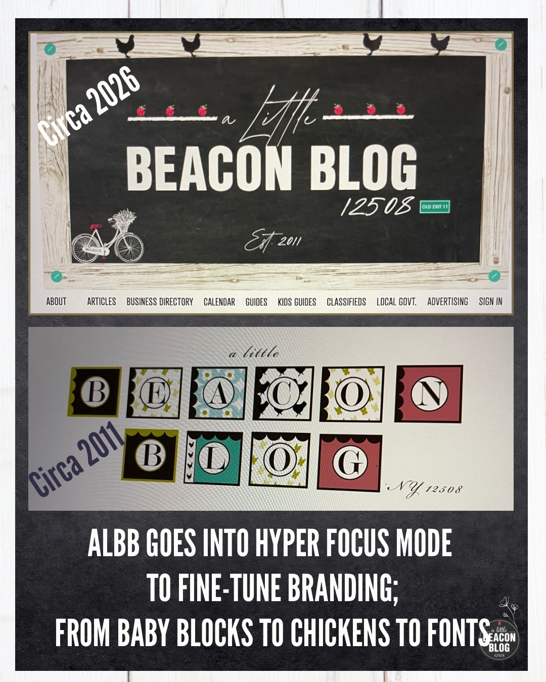
A Little Beacon Blog’s Original Logo Circa 2011 - Baby Blocks and Chickens
To ease the fear of the transition, I realized it is time to remind current readers of A Little Beacon Blog’s original logo. Only my mother may remember this logo, and when I wanted to change it, believe me, she lamented the change. This is back when A Little Beacon Blog was based in Blogger, which was Google’s free blog platform. When I changed the logo, I also changed the platform to Squarespace. We ported the content from Blogger to Squarespace and continued on.
The original logo was inspired by the blocks of art down by the Beacon train station that welcomed people leaving the train station. I was mildly obsessed with the letter blocks at the time.
A Little Beacon Blog took inspiration from those art blocks, to create baby blocks (pictured below). I had just had my first baby. Baby Brain was in full swing, and I was surrounded by gorgeously illustrated baby books.
The letter blocks sat on undeveloped property owned by a friend of then Councilperson George Mansfield. Through that arrangement, an art installation of the blocks was created. But when the developer was ready to build what is now the townhouse apartments on that land, the art blocks were removed.
As you can see from the video below of the original logo, the font was quite sophisticated. A sharp serif for the letters in the blocks, and a grown-up script that you might find on a fancy menu for the letters outside of the blocks.
I reassured the reader that I was not changing the name, but was tweaking the font.
“The font must be legible.”
True. True. However. People have taken A Little Beacon Blog to be their own. They have abbreviated it. Some called it “Little Beacon Blog” or “LBB.” This is an acronym I never imagined. People for years have been calling it “The Beacon Blog.” Which is an amazing honor, because how can we be The One!
One reader said, when the tipping point just began several years ago: “I guess you won’t be so little anymore.” I took that to heart, because while A Little Beacon Blog might and does grow, my fascination with little details that lead into big things remains.
Therefore, a question: does the word “little” have significance here? Would people miss it if the word “little” was omitted? I mean. I go back and forth on this. I love the word “little” in here. But. It does undermine the blog. I invites people to beat it up. On the other hand, that can serve advantageous as people underestimate it.
Therefore. The name will not change.
However, part of the name may hide in the cursive font for those of us who know what it says.
Another longtime ALBB reader responded to this video and wrote in: “I don’t remember this logo.” The reader is a formerly quoted reader who’s blog name is Citizen Cowboy. “Were there always chickens?”
Yes. There were always chickens in ALBB’s logo. There were always chickens because upon first moving here, when looking at houses, roosters could be heard in the distance. “People have backyard chickens,” the realtor said upon entering one of the houses for sale as a rooster crowed in the distance.
Backyard chickens seemed neat. I currently still get farm fresh eggs from someone who became a website and advertising client years after I first met her. So the chickens stay in the logo.
“The letter blocks look like your house,” Citizen Cowboy continued.
“It’s true,” I replied. “I painted my first baby’s room the robins egg blue with the brown scallops. I was putting scallops on everything.”
So that’s it. That’s the Origin Story of A Little Beacon Blog’s logo evolution.
What is super new in this logo is the addition of the green highway sign that is a nod to the Old Exit 11. Still pondering if that fits or not.
Onward to the tweaking of other elements of it.